eMAG
Rebranding, 2019—Design upgrade
The new logo design increased visual impact and modernized the brand by conveying shopping joy and a more contemporary vibe.
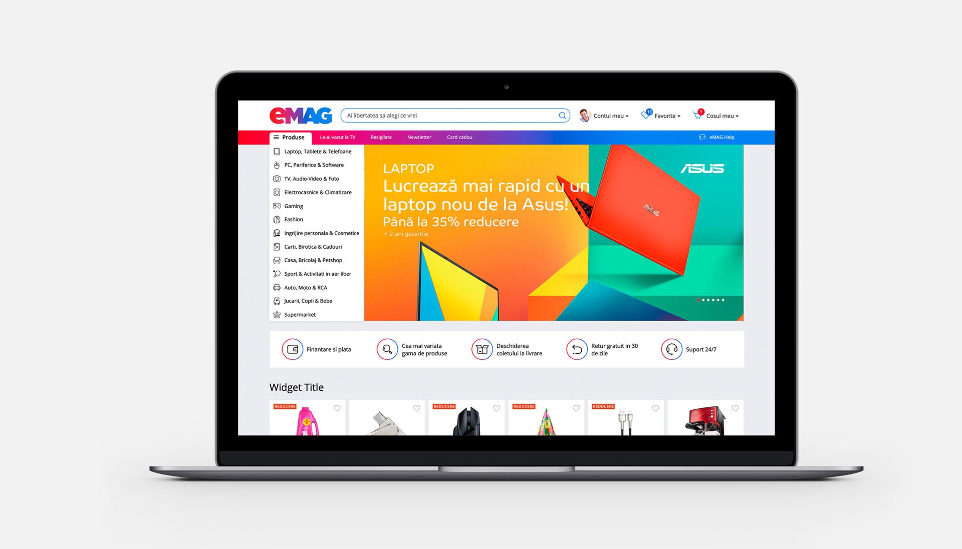
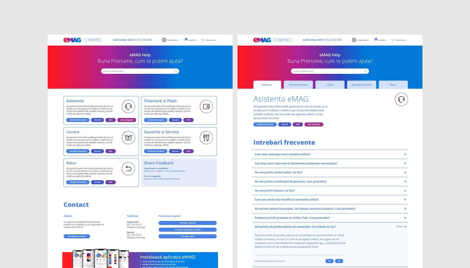
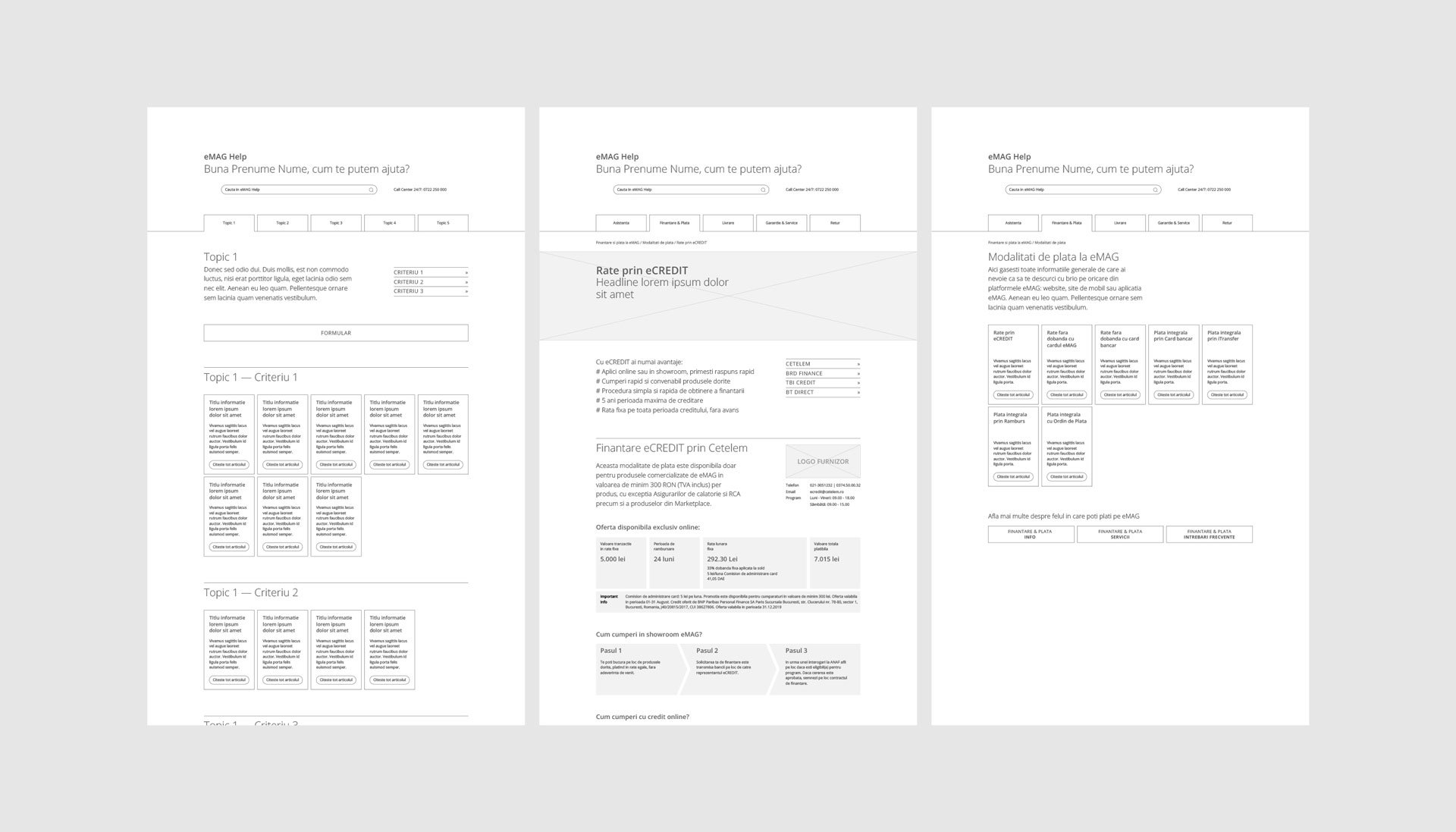
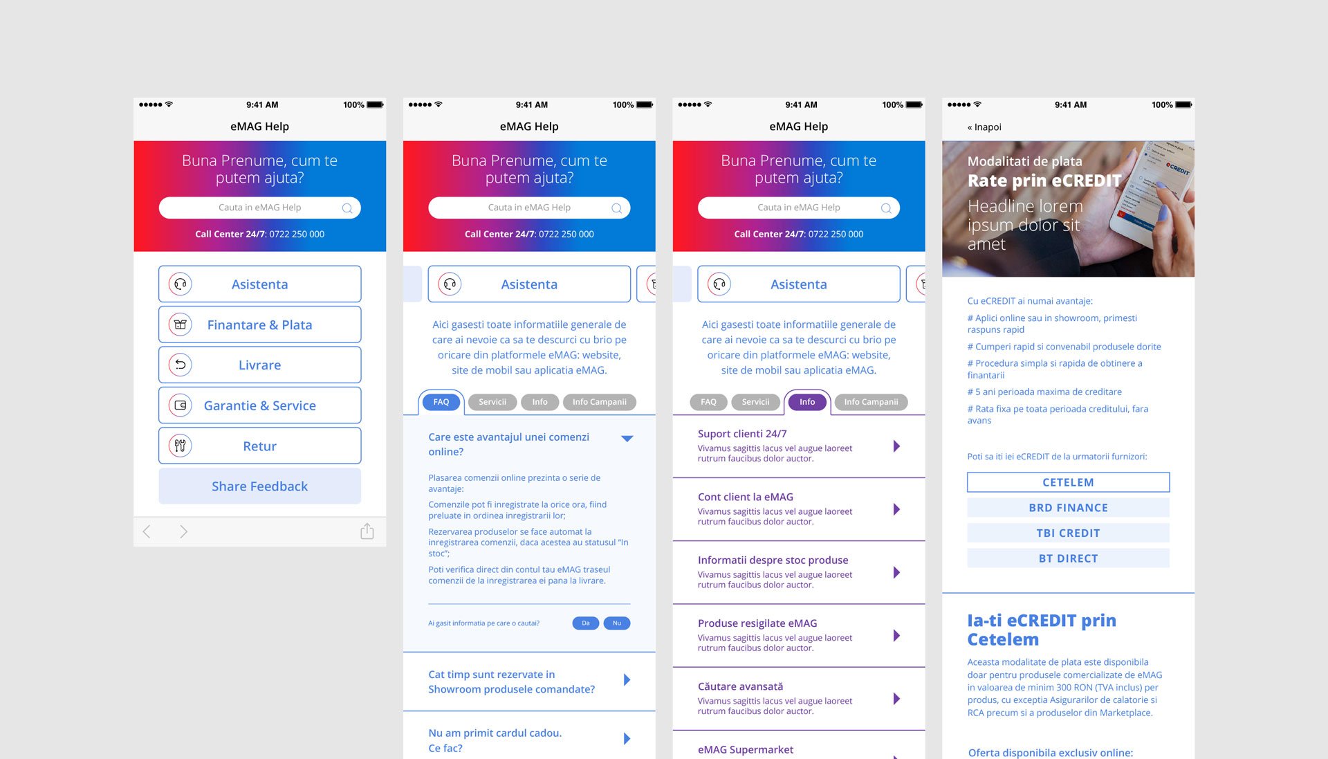
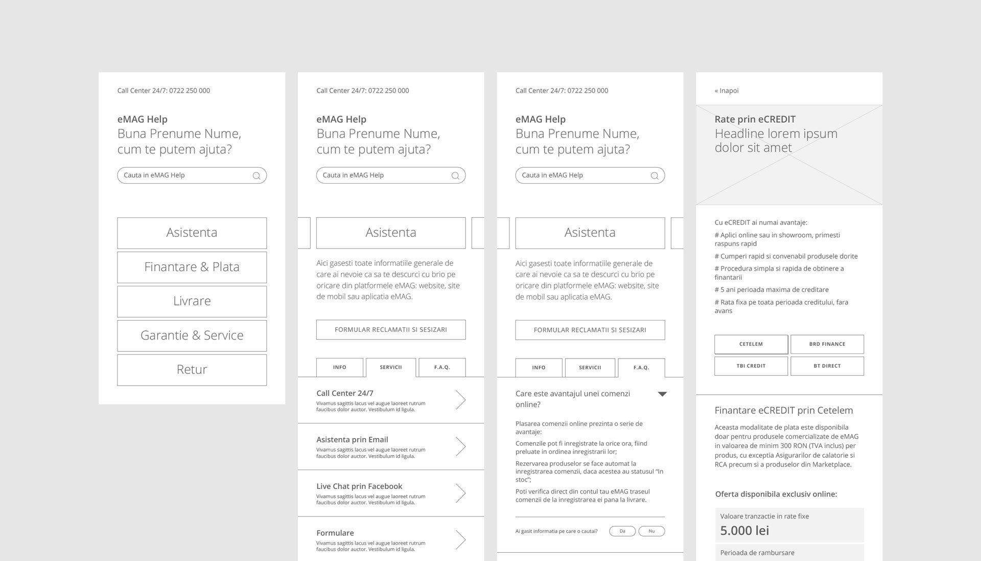
The new logo design imposed the redesign of certain parts of the site and strategic decisions at the level of the visual digital platform.
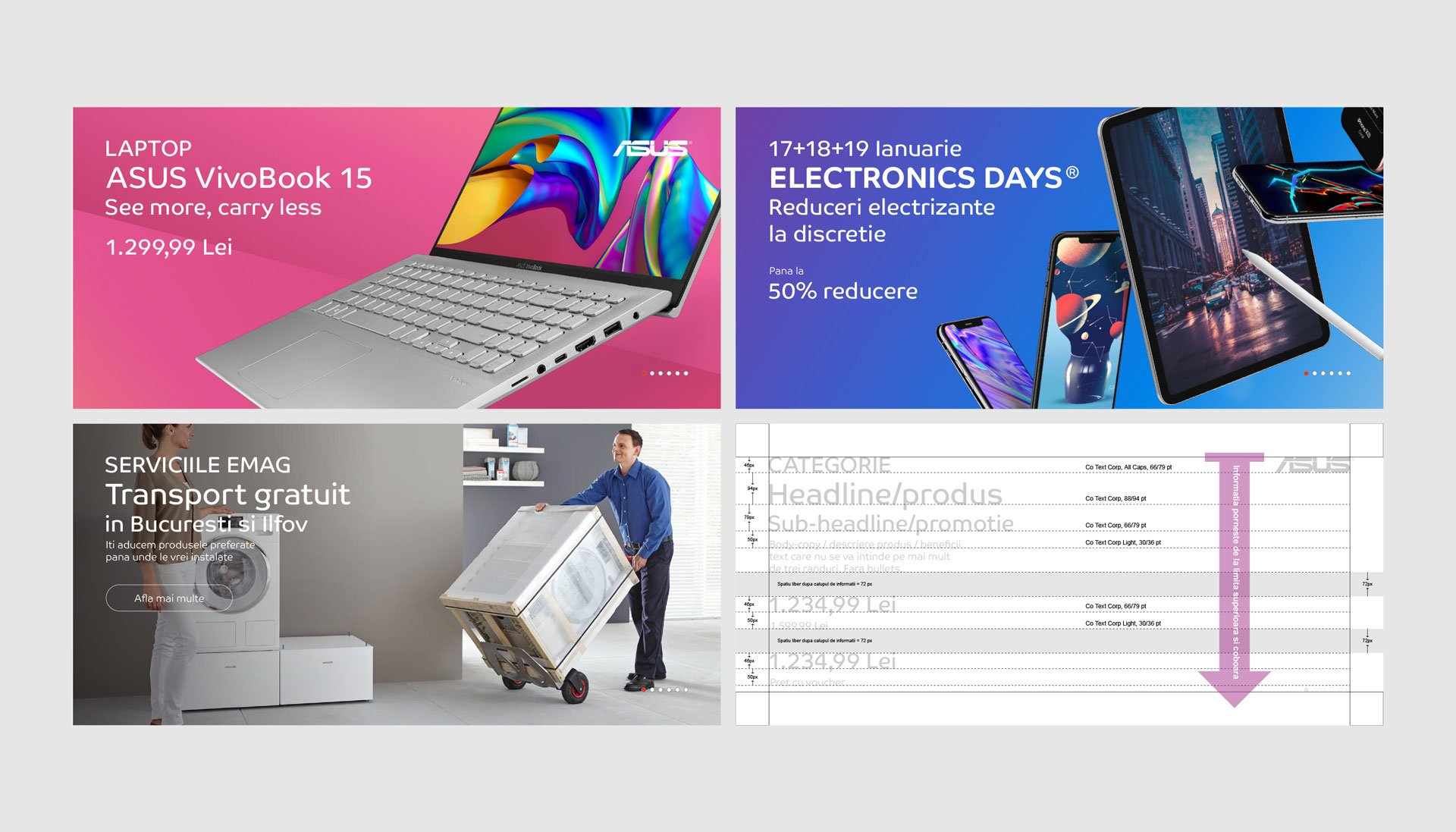
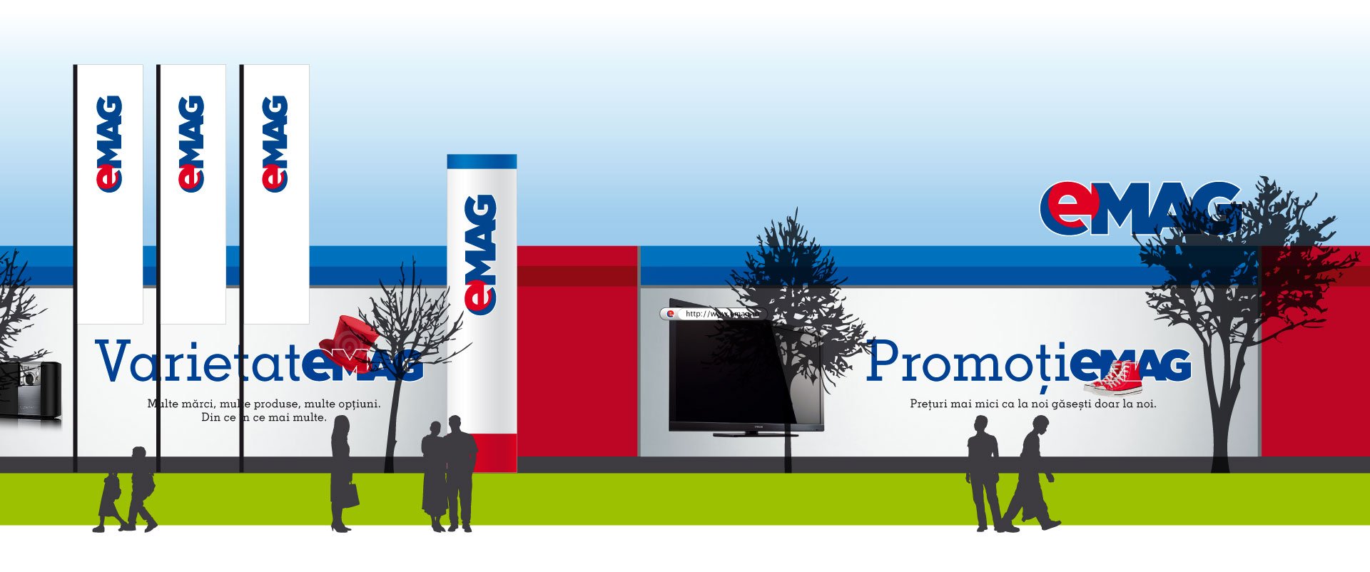
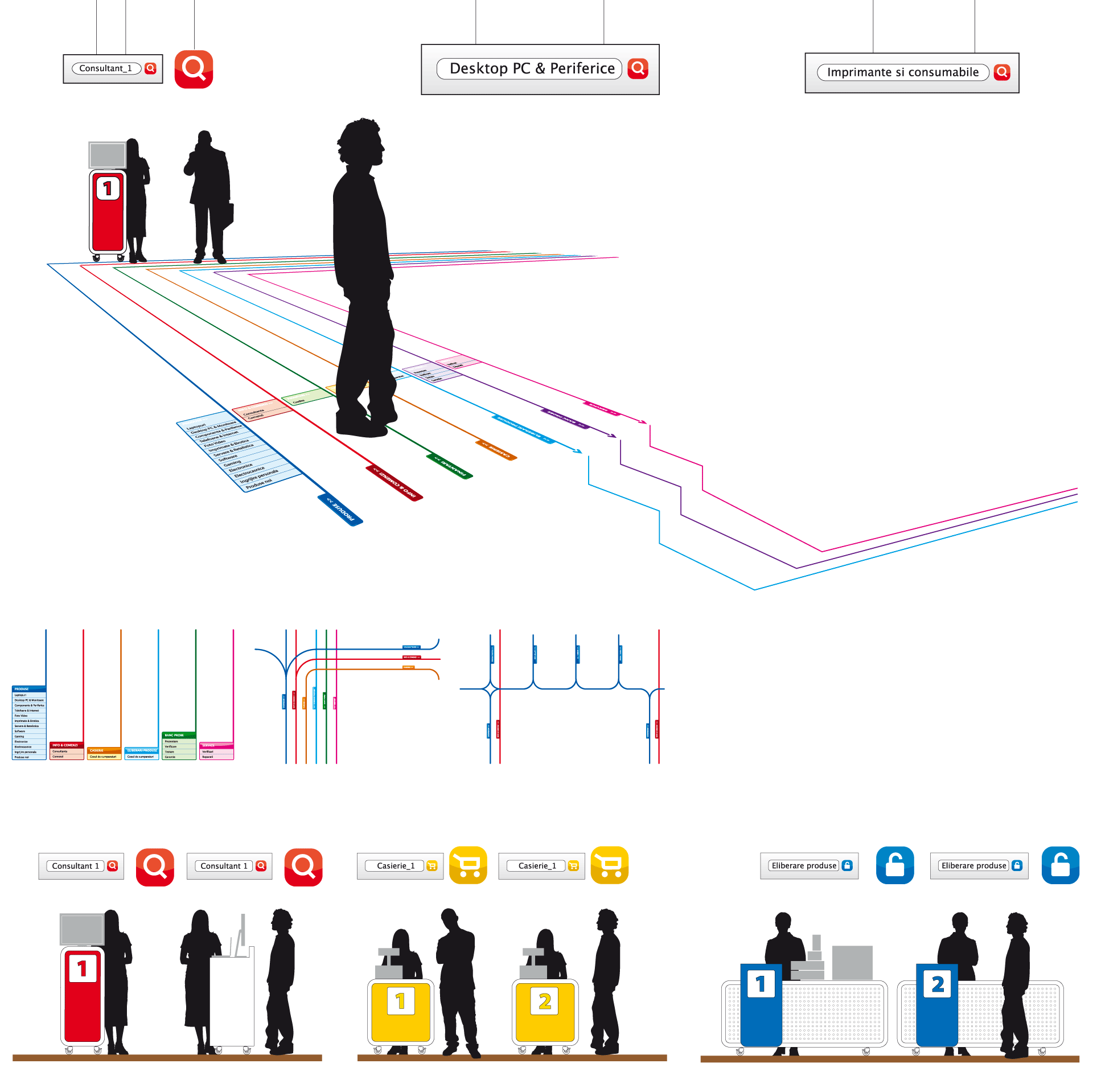
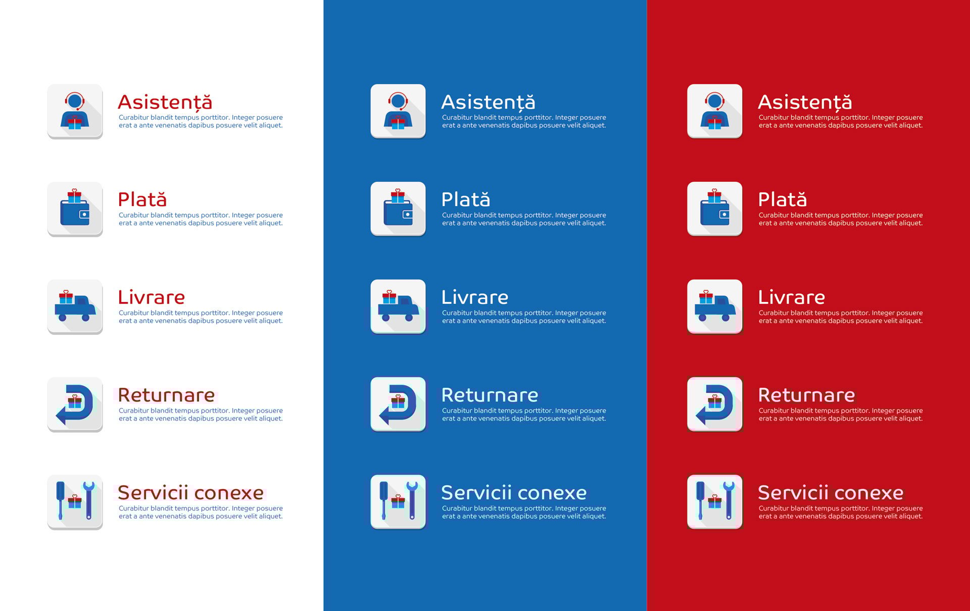
The on-site advertising platform was comprehensively overhauled and standardized for style consistency and operational efficiency.
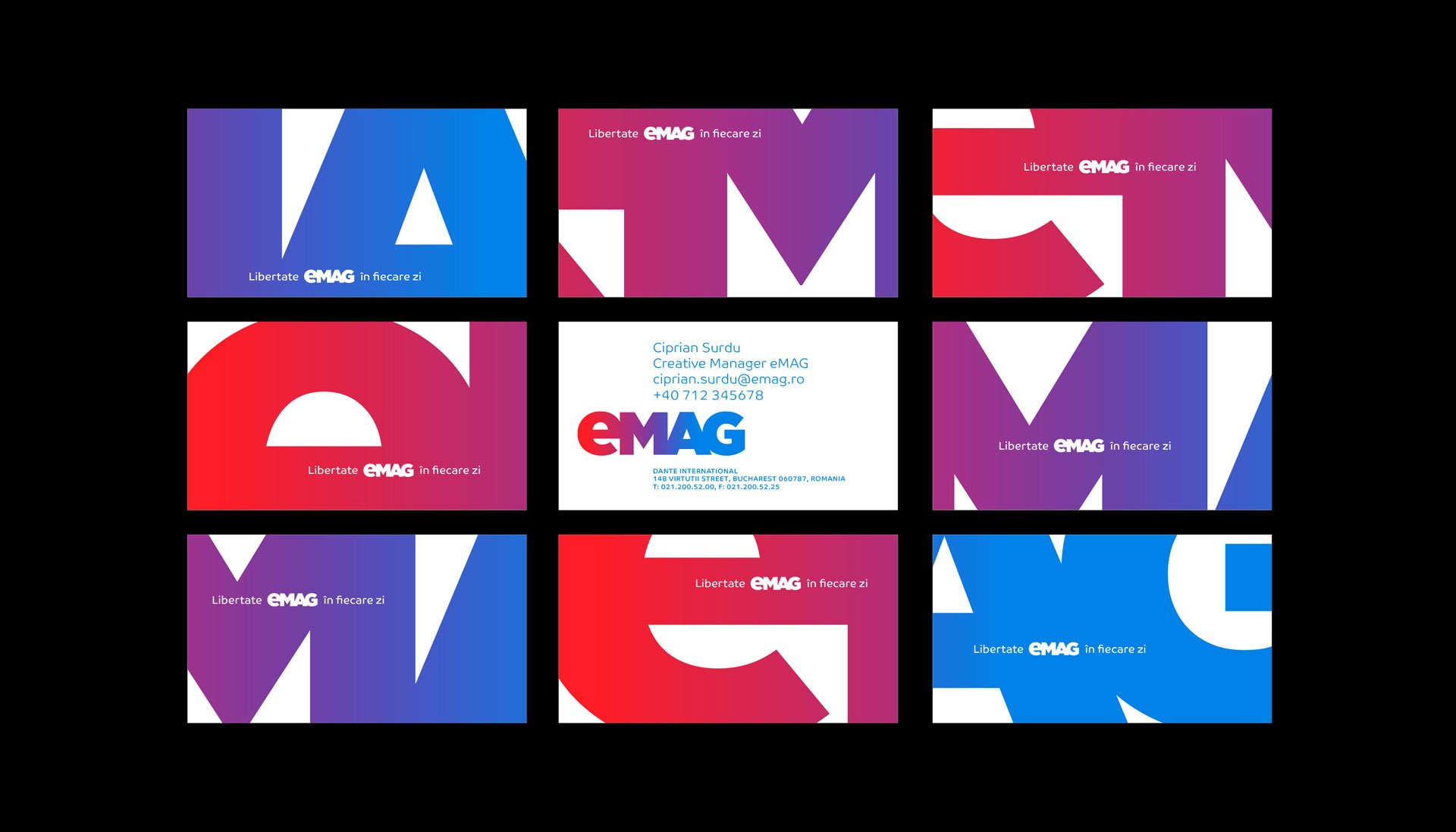
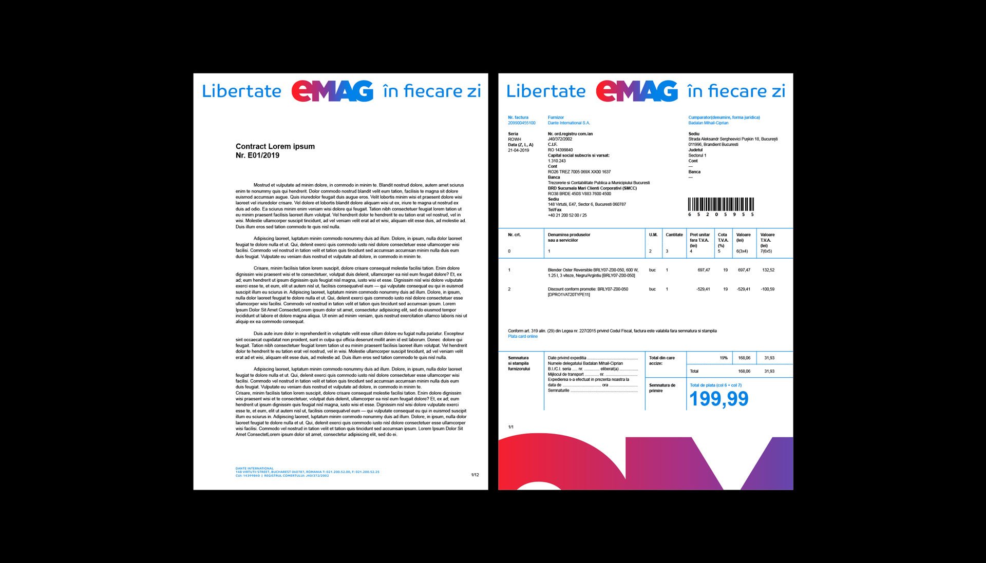
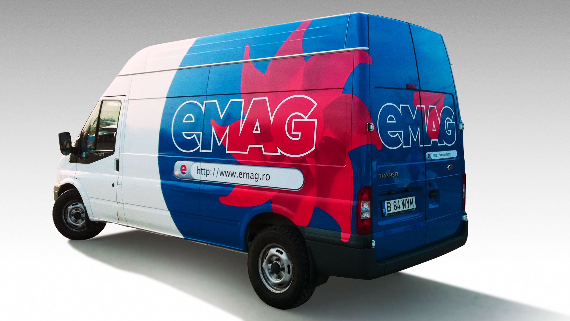
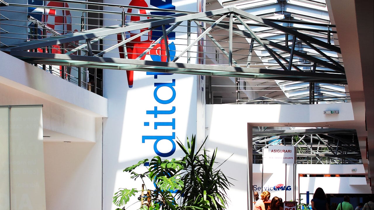
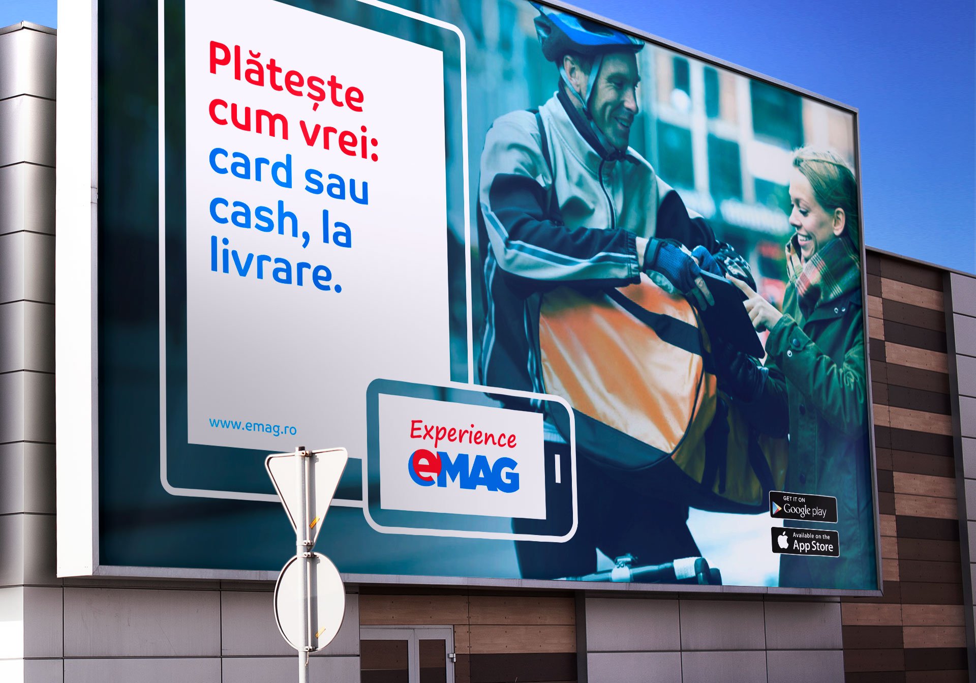
For off-site advertising and electronic signage, the logo was dramatized and animated by leveraging the new opportunities provided by the color gradient.
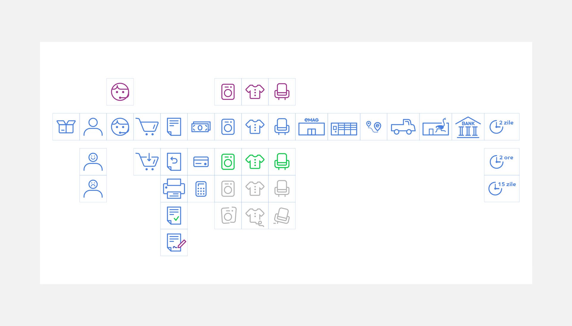
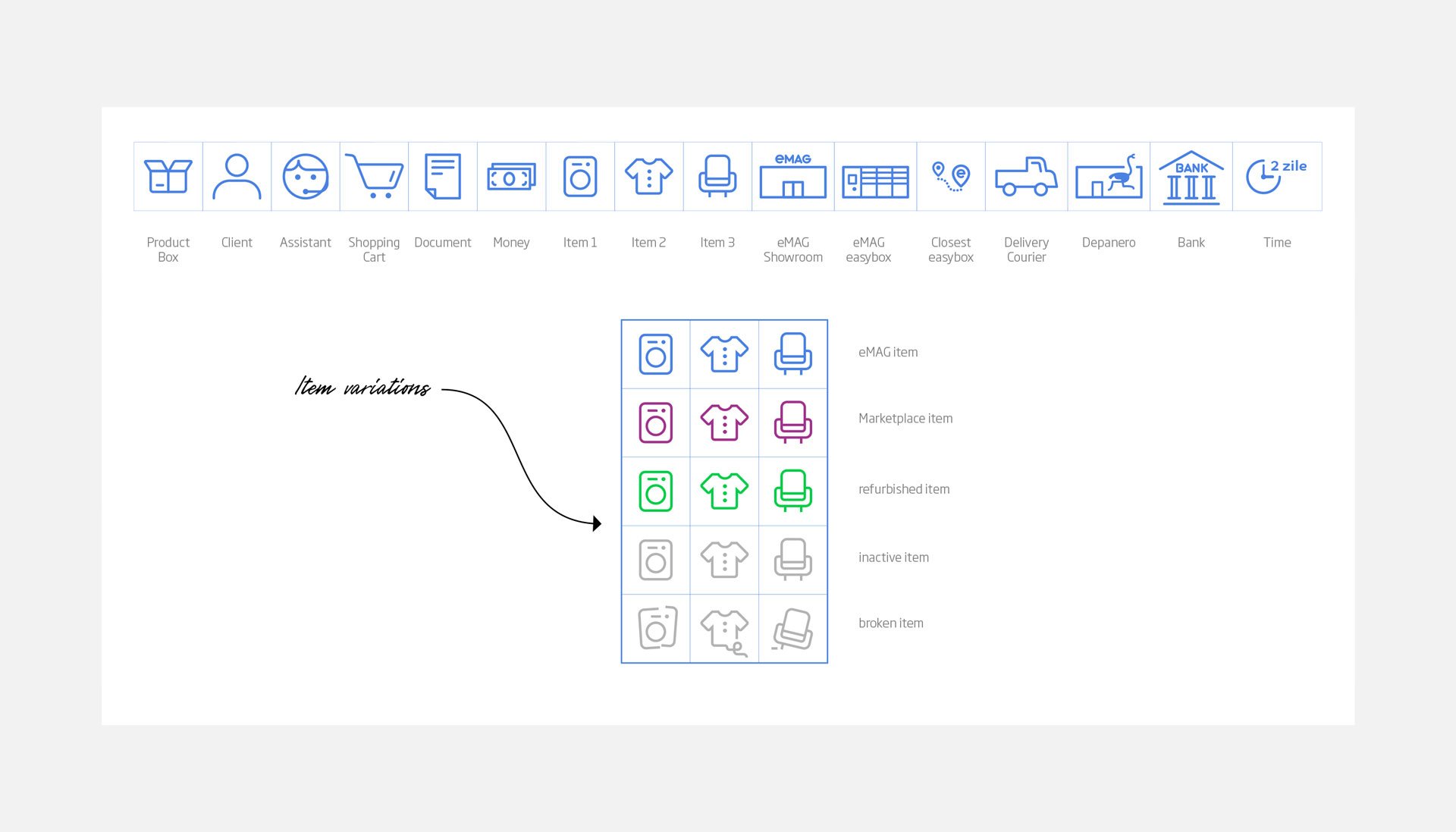
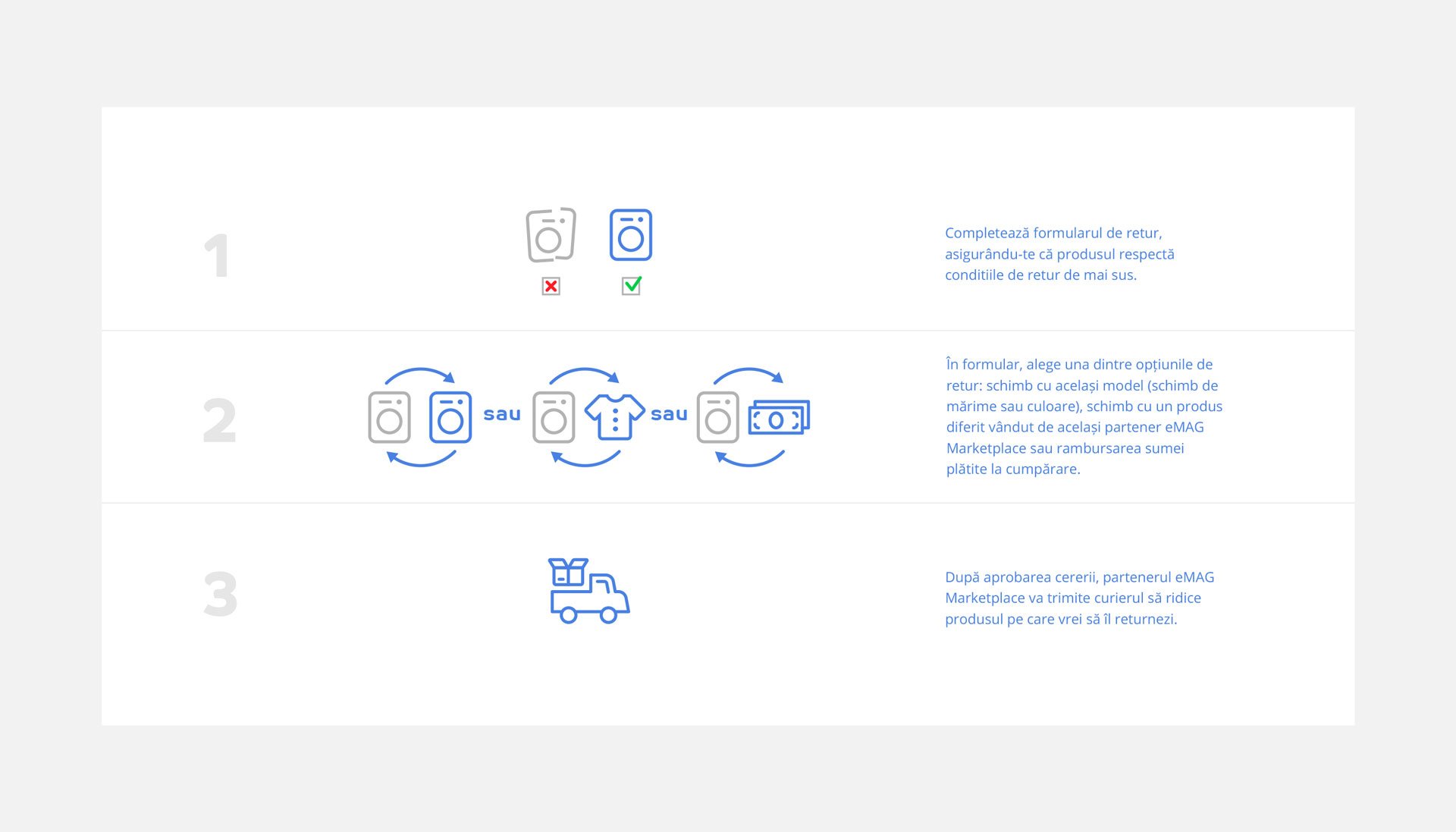
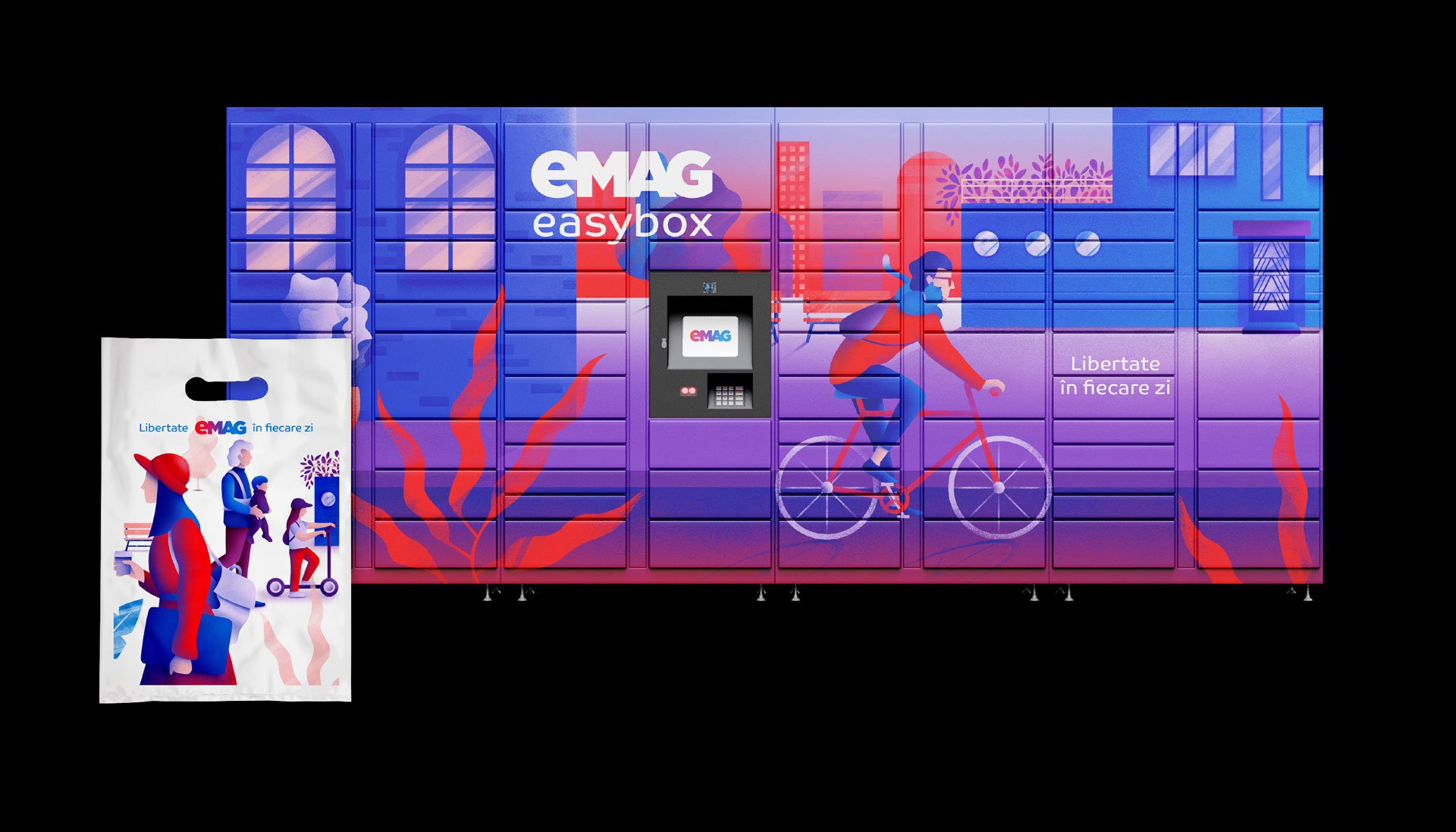
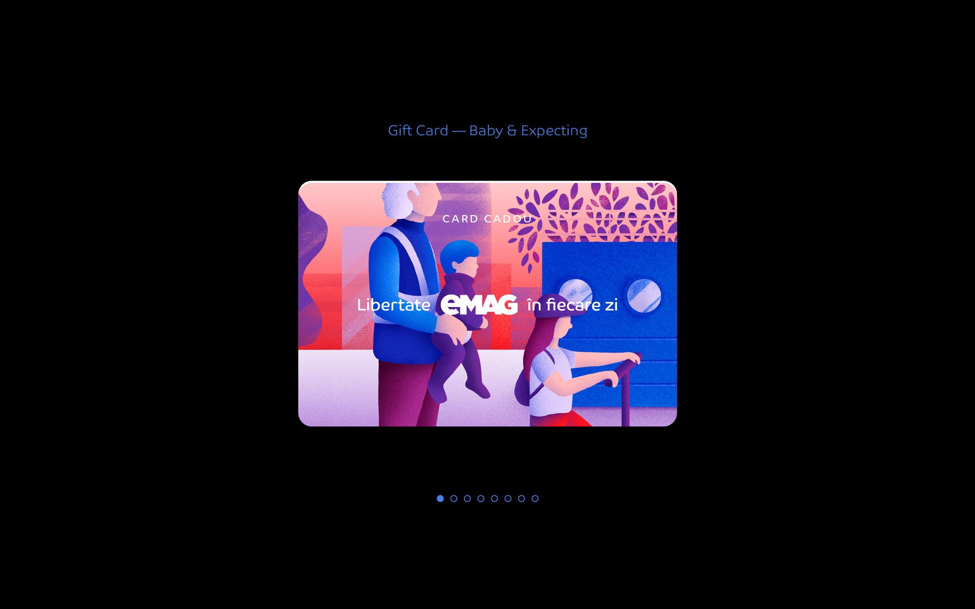
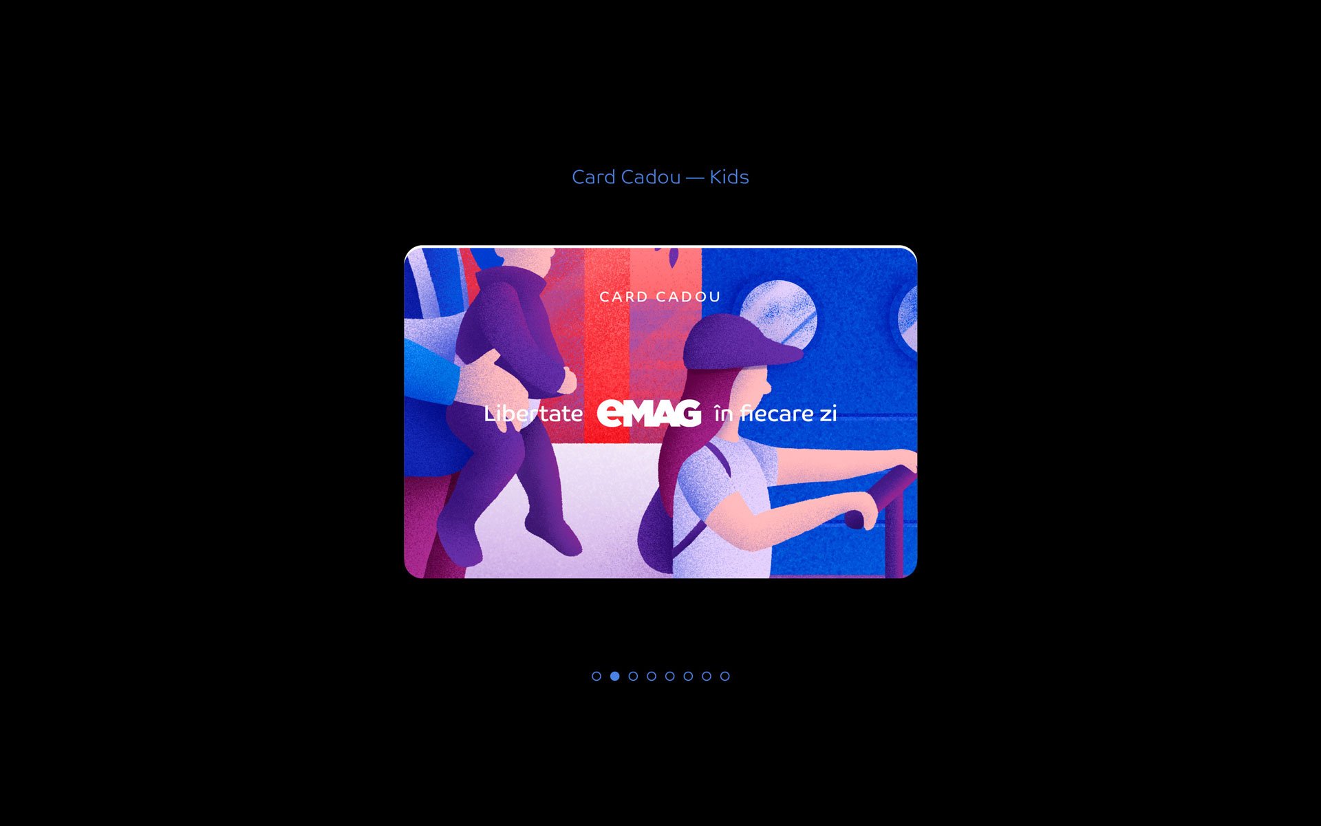
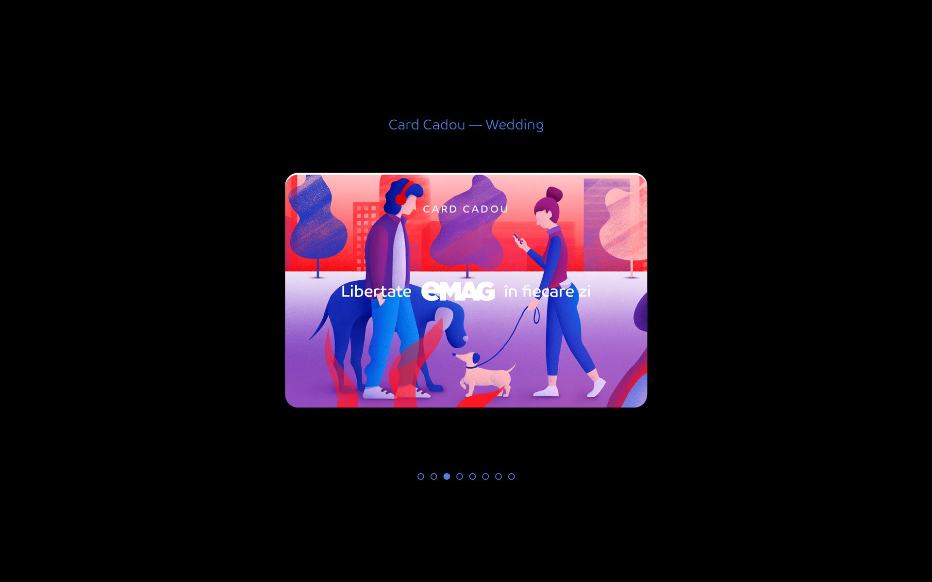
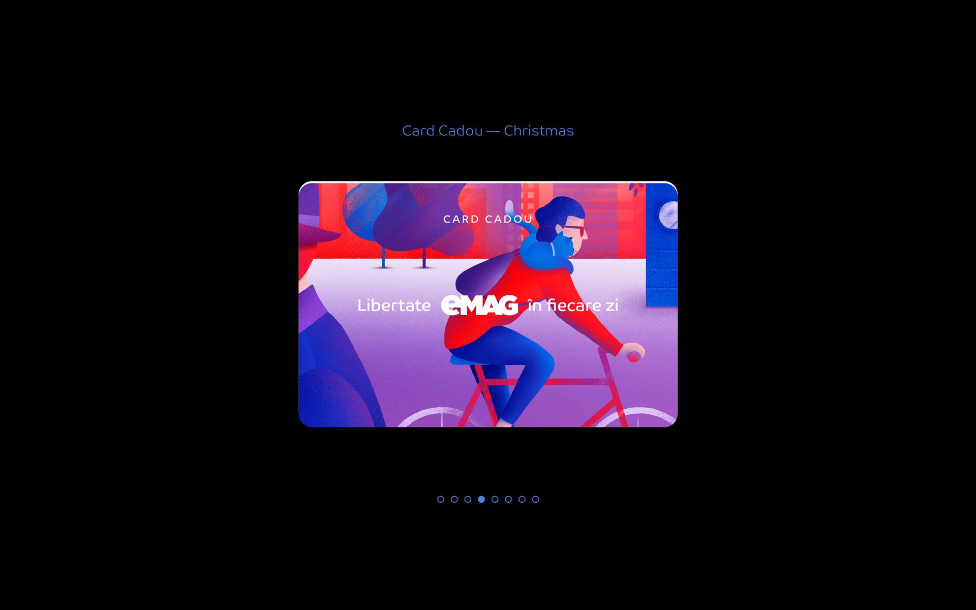
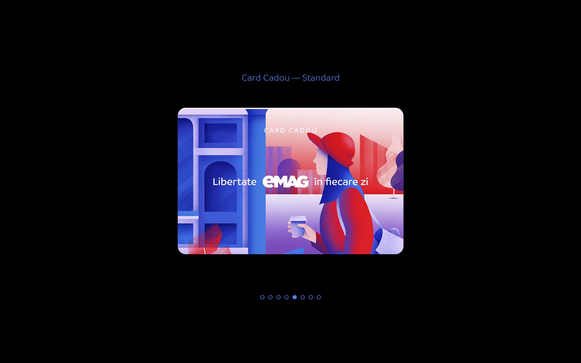
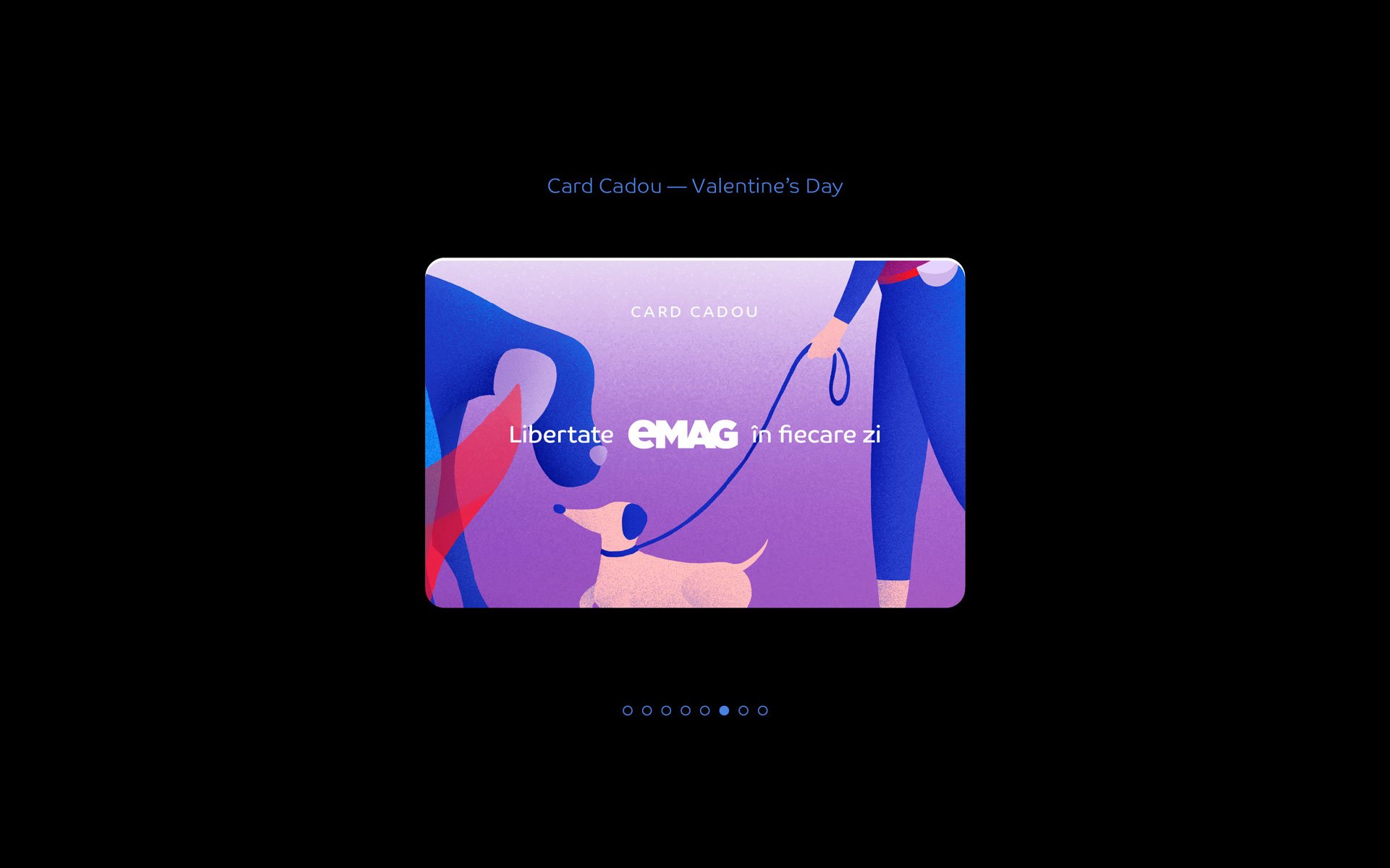
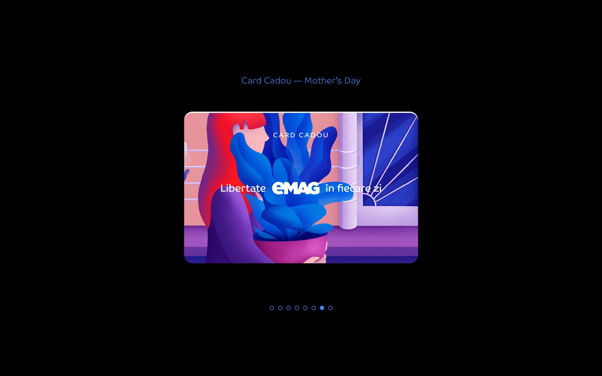
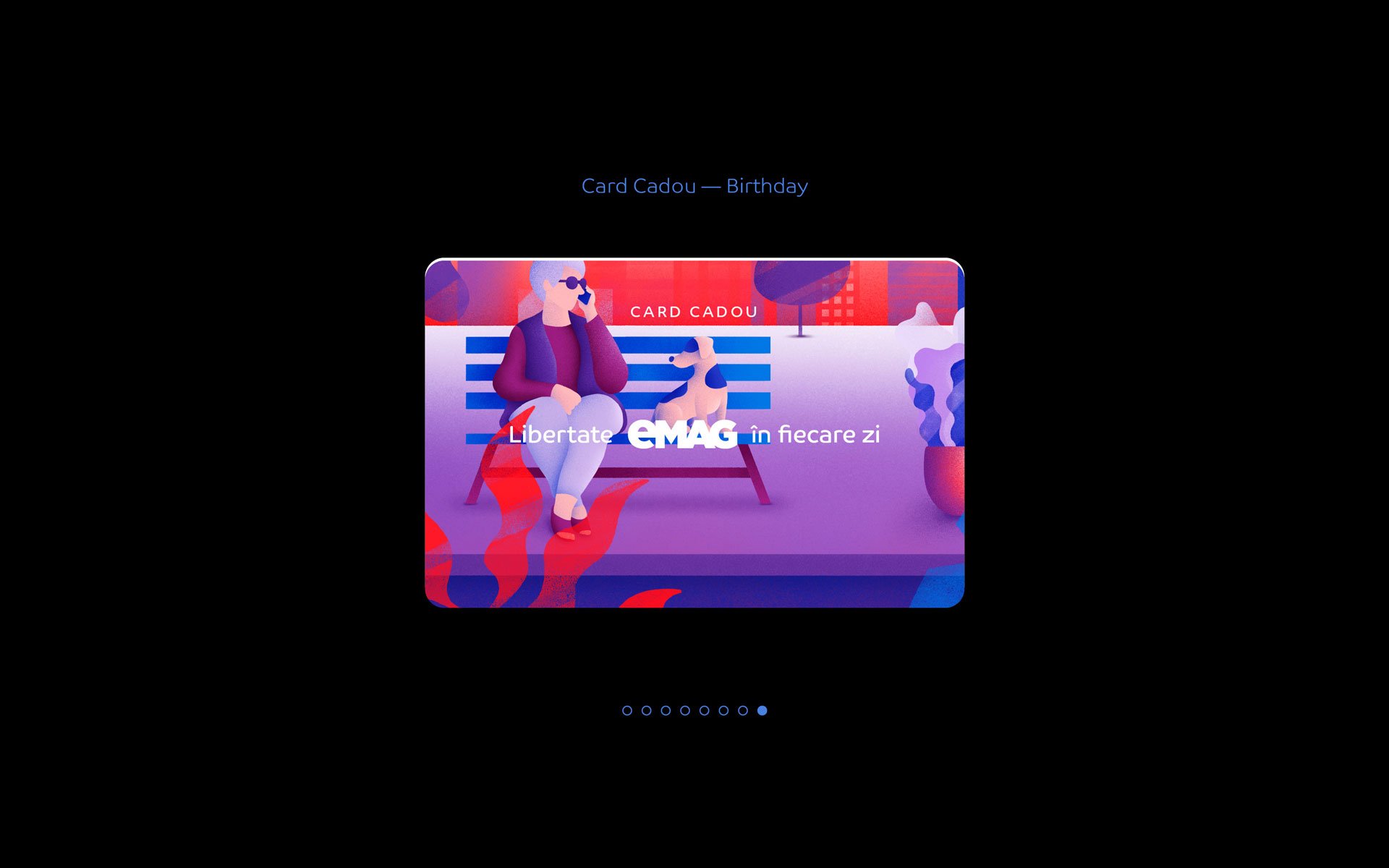
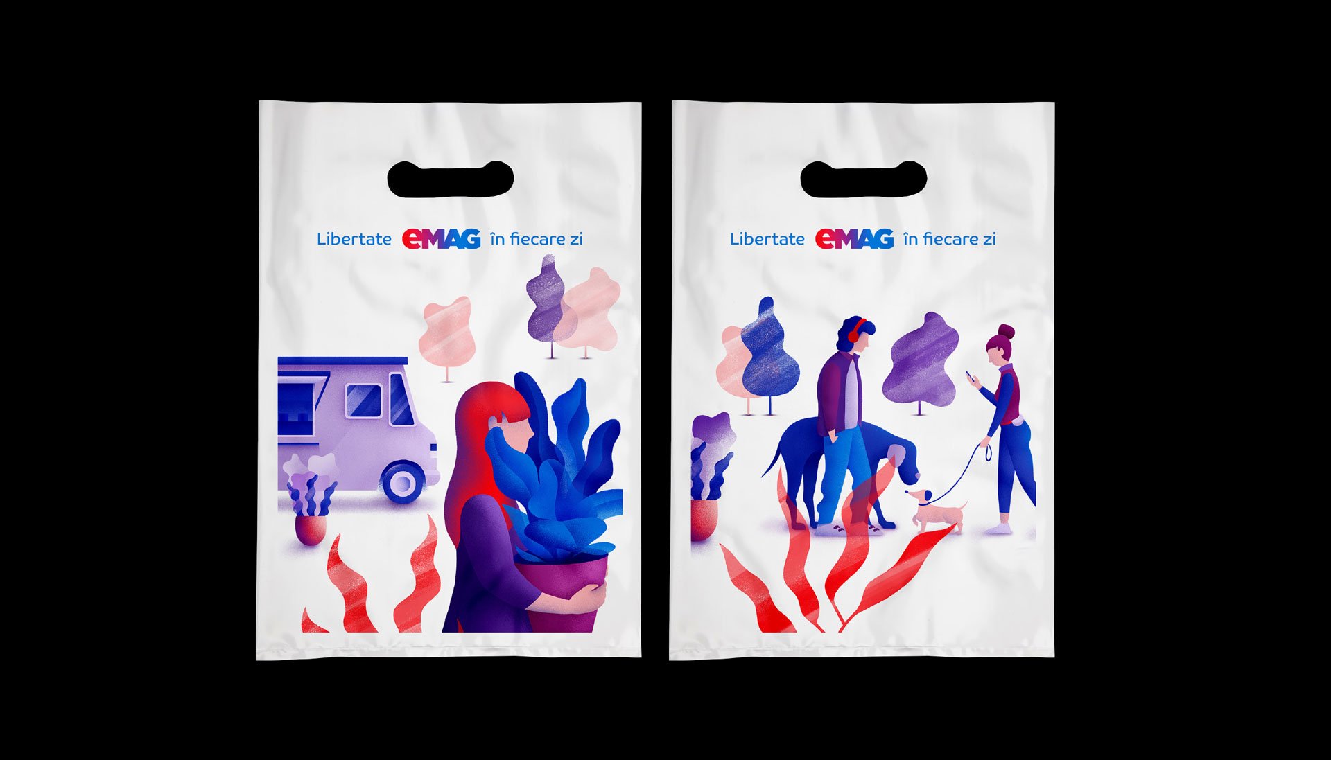
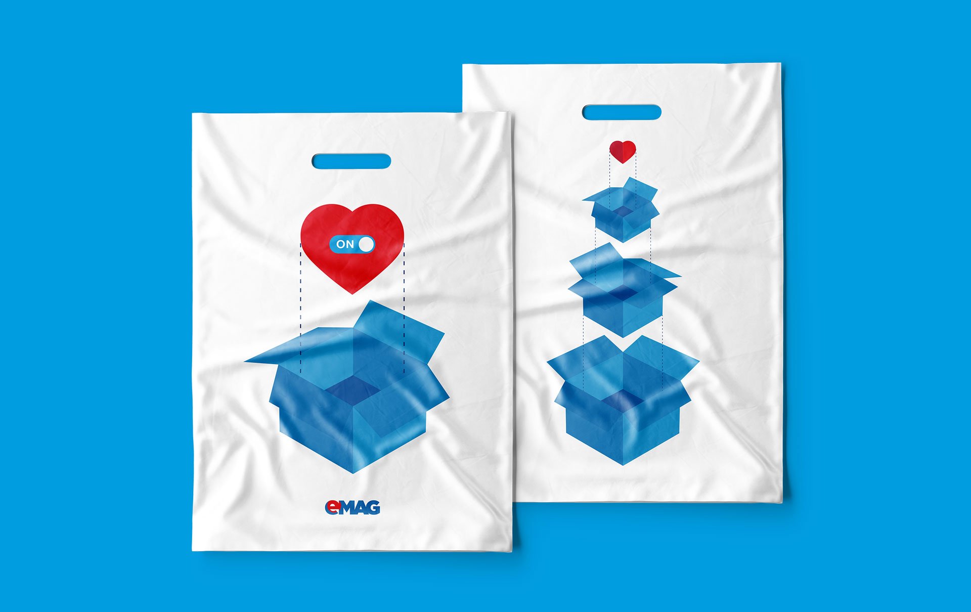
A flexible, modular, layered proprietary illustration system was developed for the delivery lockers, accommodating locker blocks of any dimension. The illustration system was adapted for other branded materials: bags, gift cards, etc.
Client:
eMAG
Industry:
E-commerce
Project type:
Rebranding (reconstruction, repositioning, design upgrade)
Year:
2019
Services:
Visual Identity, Web & UI Design
Corporate Brand Design, B2C Communication Design, Retail design, Packaging design, Brand Guidelines, Internal Communication Design


Rebranding, 2014
Despite its flawless business performance, impressive market share, millions of dedicated customers, and huge success in attracting a top strategic investor — the South African Naspers Group, eMAG needed to articulate its leadership through branding strategies.
The audit and strategy report revealed that while eMAG was the de facto leader of electronic commerce in Romania, the market didn't perceive it as such.
eMAG is more than an e-commerce brand; it is multifaceted, with various aspects directly influencing how it interacts with its internal and external audiences. Brandient worked to uncover the essence of eMAG—facilitating customer self-gratification—by defining its brand DNA, platform, and idea based on audit findings.
Brandient avoided a drastic brand identity change from the outset, considering eMAG's market position and its extensive, loyal customer base. The redesign aimed to capitalize on the familiarity of the brand name, color palette, and logo structure while infusing them with the new brand promise and revitalizing them to match the pace of the modern customer.
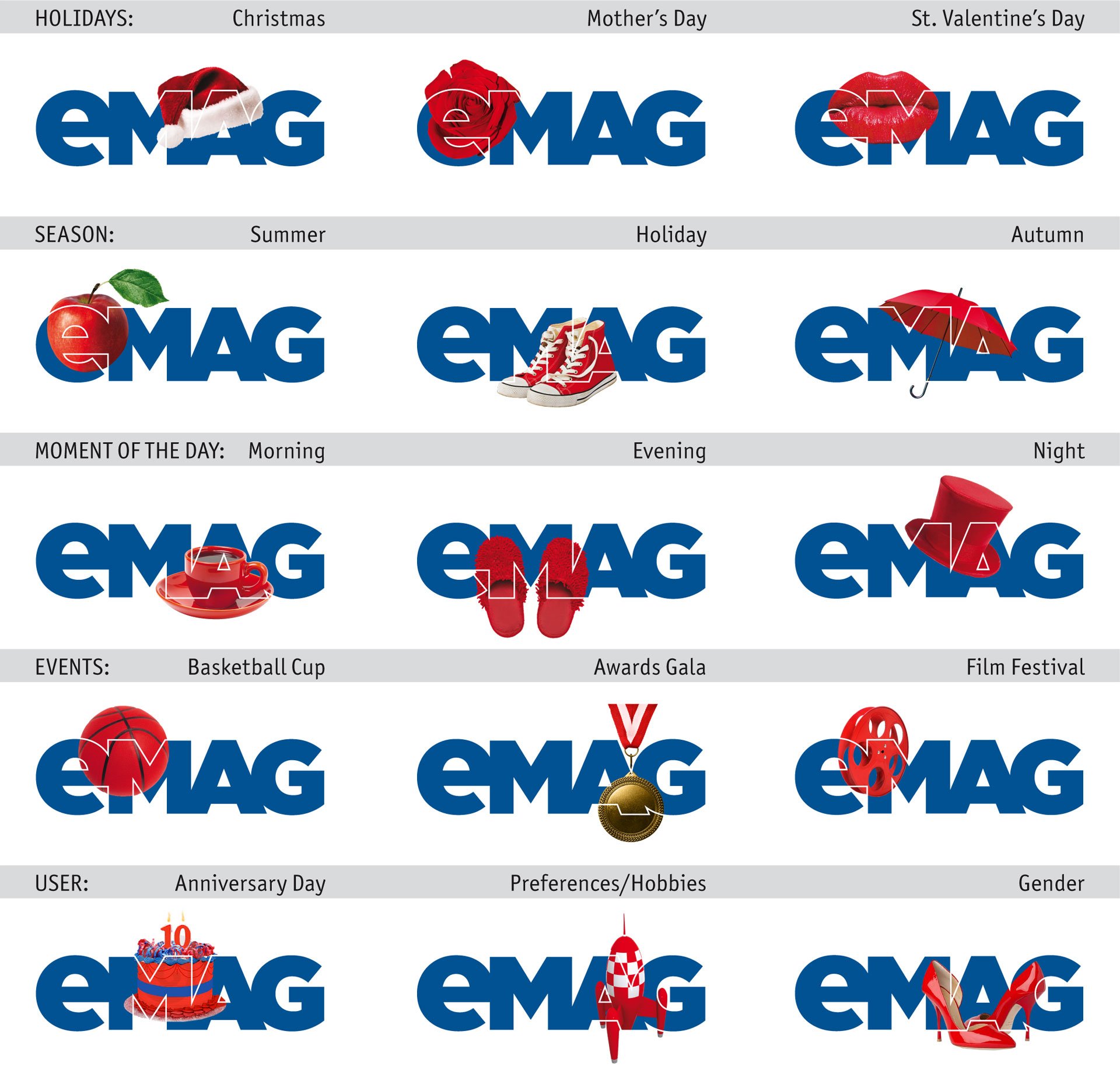
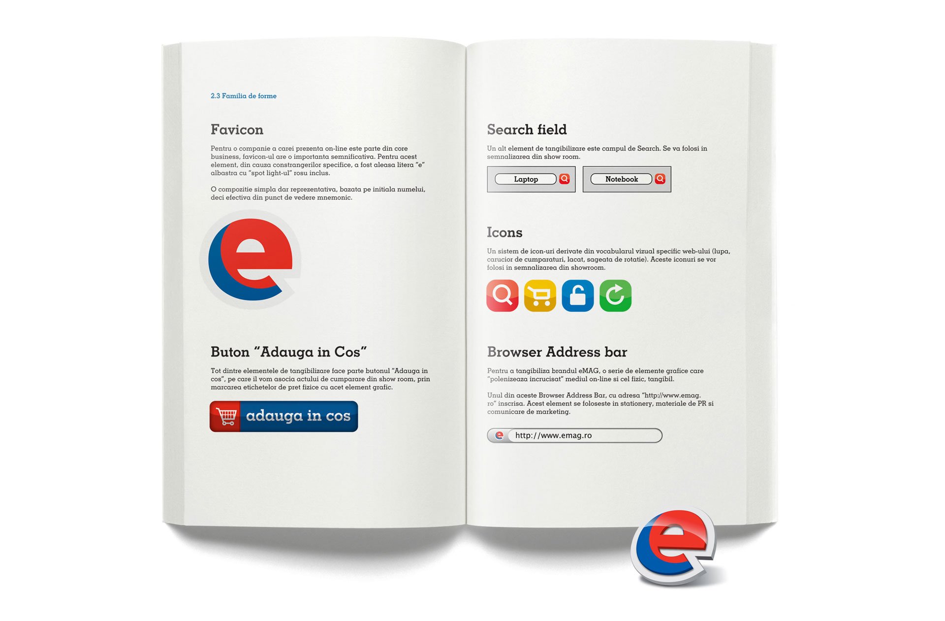
This led to the creation of the modular procedurally-generated logo: eMAG provides new reasons for enjoyment each day in a timely, relevant, and dynamic manner. The new identity also supports a highly simple and versatile communication platform.
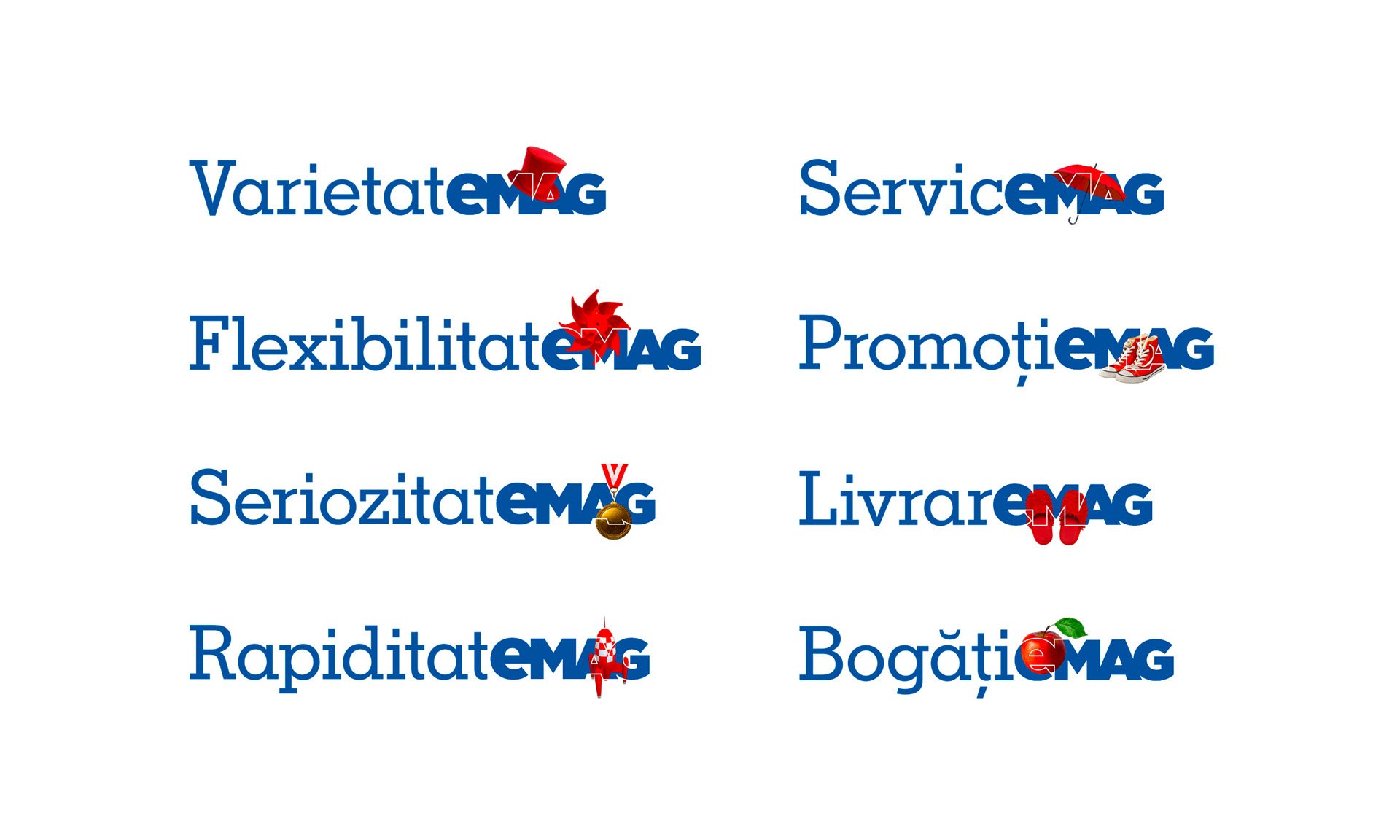
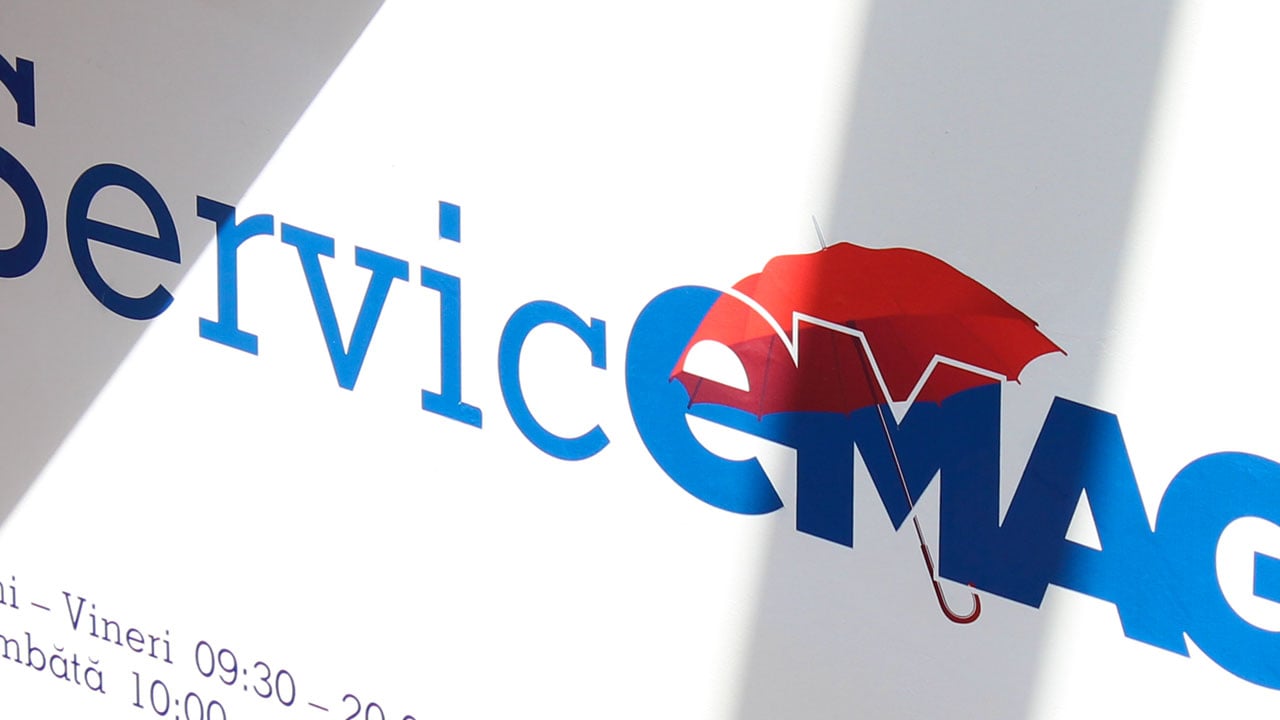
The new communication platform incorporates clever language, employing the "e" letter from the brand name to craft emotional and functional messages. This tactic was designed to boost brand awareness among new audience groups.
Client:
Dante International, Naspers Group
Industry:
E-commerce
Project type:
Rebranding (reconstruction, repositioning, design upgrade)
Year:
2014
Services:
Brand audit, Brand positioning, Brand narratives and Voice, Logo Design and Visual Identity program, Corporate Identity Program, Digital design, Branded environment (Store conceptual design, Store signage system design, Office conceptual design), Creative Communication design, EVP and Employee brand engagement, Brand guidelines
Awards:
Graphis Gold Award in 2012,
Graphis Silver Award in 2011,
Transform Gold Award in 2010
Other featured projects

Fashion DaysAbout fashion must-have and obsessive coolness.

GenecoBuilding the power-brand for Singapore's electricity market.

BitdefenderBuilding trust by reducing global cyber risks

HeyBluA witty brand focused on overcoming financial limitations.

SilvaRecreating the authentic Romanian Craft-Quality beer brand.

Team RomaniaCommercial emblem for the Olympic Team.
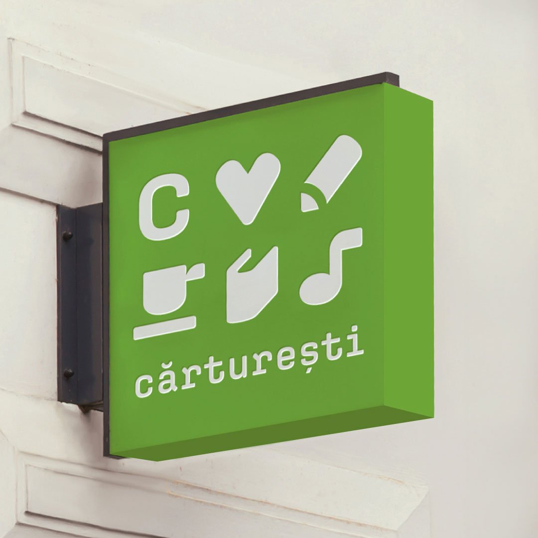
CărtureștiRebranding the iconic Romanian national bookstore.

From Skin to SoulVegan body care products for South Eastern Asia.

FreshfulFresh groceries delivered straight to your door.

TazzA stealthy lightning flash hidden in plain sight.
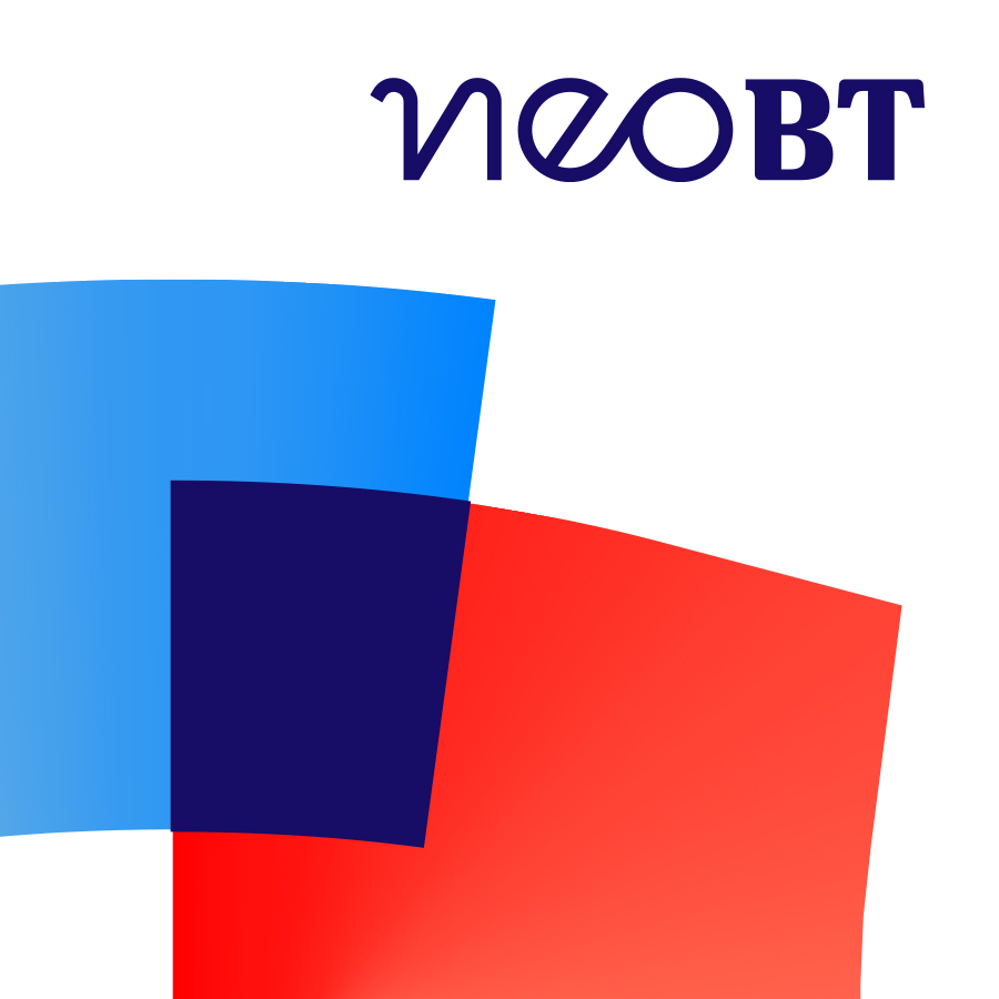
Neo BTCreating the neobank experience.

LibrisRebranding to reignite the passion for books.

CreatopySmart SaaS tools for Creative Empowerment.

AgricoverRebranding a top European player in agriculture.

VictoriabankRevitalizing the oldest commercial bank in Moldova.

Interactive GroupA future-aligned, value-rich identity for the Pakistani technology group.

LoginRoPositioning Romania as a destination for young tech talent.

O'MACRebranding the challenger in small agriculture tools.

PromaterisA new evolutionary chapter in plastics industry

National Football TeamBalancing heritage and contemporary aesthetics.

Romanian Football FederationRebranding to support the Federation’s ambitious reform.

DedemanThe rebranding that made history for the uncontested leader of the Romanian DIY.

Ro Olympic and Sports CommitteePreparing Romanian presence at the Rio 2016 Olympic Games
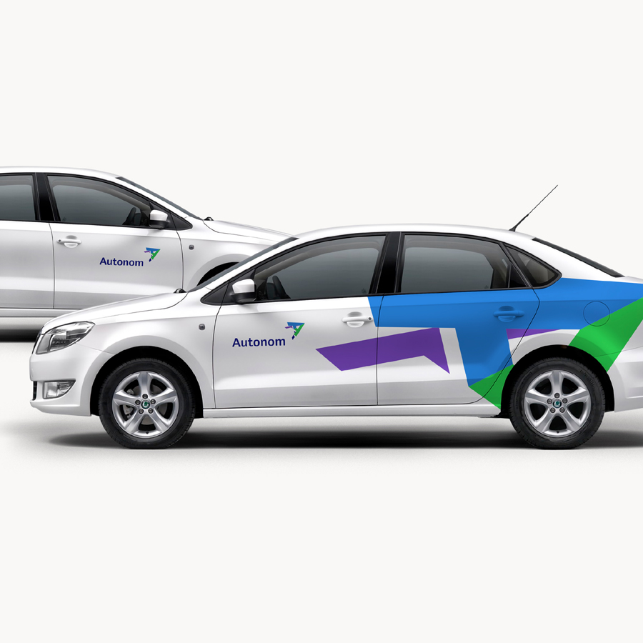
Autonom Driving growth with impactful branding in modern mobility solutions.

KlarwinLeaping to a higher reputation league of Fluid Perfection.

Biz Singapore IssueTed Dot-winning Singapore-inspired cover design.

Ave ForchettaNew brand creation in a funky Italian neo-bistro restaurant genre.

TrickshotRebranding of the epitome 'eatertainment' restaurant chain for growth.

CartofisserieBuilding a French fries emporium brand.

BadsterThe thirst to break every rule in the book

HelpNetRefreshing and repositioning a leading pharma chain.

SolarisNew brand alignined with global healthy nutrition trends.

Rugby RomaniaLorem ipsum dolor sit amet

QFortBuilding a success story within the European market.

Idea BankA “Fresh banking from Poland” brand localization.

NextebankCreating a “next-gen banking" brand experience

PeliPartnersConsolidation of the law firm led by the power couple Francisc and Carmen Peli.

Ro Football CupRebranding

Agora Floreasca A chic urban mall, blends wit and geography in its symbol.

TinmarEstablishing a leading energy services integrator.
NeumarktLorem Ipsum
CiucLorem Ipsum

GambrinusLorem Ipsum
Ciuc RadlerLorem Ipsum
Impetum GroupLorem Ipsum
PolianaLorem Ipsum

ShopmaniaLorem Ipsum

MerchantProLorem Ipsum

Patria BankLorem Ipsum

DLA Piper DinuThe 15th anniversary and a fresh communication design concept

E.ONLorem Ipsum

Paval HoldingLorem Ipsum
YTL GroupLorem Ipsum

EvergentLorem Ipsum
RTCLorem Ipsum

FabryoLorem Ipsum

City of OradeaThe edge of branding practice: place branding.
Cetatea OradeaReviving a Destination brand.

KindityEarly education in Malaysia, fostering 'nurturing kindness, releasing potential'.
BiogoodPioneering modern organic retail.
LucaLorem ipsum
OrigoLorem ipsum
Țuca & AsociațiiLorem Ipsum
CuculandLorem Ipsum
SecomLorem Ipsum
QualiansLorem Ipsum
FrudisiacLorem Ipsum
ÜbernutsLorem Ipsum
FonomatLorem Ipsum

DomoLorem Ipsum
ApidavaFrom humble beginnings to an internationally recognized Transylvanian honey brand.
AstralLorem Ipsum

YardiniLorem Ipsum
ToyplexLorem ipsum
ExigioLorem Ipsum

Europa FMLorem Ipsum
Balvanyos ResortLorem Ipsum
EuropharmLorem Ipsum

Nanoramic LabsLorem Ipsum

FastCapLorem Ipsum

NeocarbonixLorem Ipsum

Folkwear SocietyLorem Ipsum
SmartreeLorem Ipsum
AktaLorem Ipsum

Good RoutineLorem Ipsum
FulgaLorem Ipsum
EquiliantLorem Ipsum
StockDayLorem Ipsum
Nemo ExpressLorem Ipsum

Alfa·Bank InSyncLorem Ipsum

BrioLorem Ipsum
AlbalactLorem Ipsum
DelacoLorem Ipsum
Fortuna CoffeeLorem Ipsum
SavanaLorem Ipsum
CEC BankTurning around the oldest banking institution in Romania
Transavia FragedoLorem Ipsum
ChalibriaRebranding
BrewzeusMaterializing a new evolutionary chapter in the local plastic industry
GeoklastData intelligence powering solutions in waste management sector.
Făgăraș World-Class Nature ReserveA love brand for Europe's largest, wildest natural park destination.
AccesaStrategic digital transformation services.
Peakture HotelMake yourself some beautiful memories.
BluidInnovative water-based solutions for professional and residential use.
Brico DepotPost-M&A design and culture adjustments for the DIY chain.
CRHPost-M&A brand consulting and localization.
EuroanswerRebranding the BPO expert in both emerging and established European markets.
F·Zeen ResidencesNew brand for the chain of high-end apartment projects.
ING BankCulture explorations and adjustments.
InmedioBrand and design update for the chain of convenience stores.
Transilvania InvestmentsRebranding the former SIF Transilvania (Financial Investment Society).
Pant Hoot MovieDocumentary about a master chimpanzee linguist.
ExavetNew brand for Regina Maris's veterinary imaging and analysis lab.
VeritheraNew brand focusing on advanced, client-centered complementary medicine.
Romanian Embassy in SingaporePro-bono work for the Romanian Embassy in Singapore.
YTL FoundationScholarship, thought leadership, and community projects in Malaysia and beyond.
AngstRebranding of the quality meat products company.
Merinde UrbaneNew brand for tasty, nutritious, ready-to-serve meals.
GlaxoSmithKlineConsulting on cold and flu brand portfolio
Mega ImageComprehensive retail design upgrade for the supermarket chain.
Orange SchoolContent, design and seminars for the Orange Communication School.
Bunătăți de la BunicaBrand and packaging design update for the line of cooking ingredients.
WiesanaLorem
UnireaLorem
Tomi KetchupLorem
LincoLorem
FrühstückData intelligence powering solutions in waste management sector.
RadiocomLorem
RenaultLorem
Blue TrainLorem
Tall BallLorem
TBI CreditLorem
TerrasignaLorem
Tetra Pak PakoLorem
Papane by TransaviaLorem
Tezyo StoresLorem
Volvo TrucksLorem
ZentivaBrand localization and positioning consulting.
GE MoneyBrand consulting on merger between GE Money and Garanti Bank.
TunisianaRebranding of Tunisiana, the national Tunisian telco and local success model.
BRD Societe GeneraleBrand strategy consulting in response to the global financial crisis.
VodafoneBrand strategy consulting in response to the global financial crisis.
Indygen for VodafoneLorem
Careers — Brand DesignerOpen Position
News radar
Join the Brandient community! Stay in the loop with innovative branding insights, exclusive design content, and inspiring case studies.
Stay in touch with Aneta's latest opinions — articles, interviews, and podcasts — on entrepreneurship, marketing, branding pioneering, leadership, and culturally meaningful current events.
Brandient Radar is a select and non-intrusive, low-volume newsletter.
Follow our flight path — sign up for our Radar newsletter today!
get in touch
Client? contact us
5 Mendeleev Street, 3rd floor,
Bucharest 010361
Expert? Join Us
Are you brimming with talent and unshaken by challenges? Then, consider this your invitation to join our elite team, dive into complex problems, and have the opportunity to see your work make a mark far and wide.
Please submit your cover letter and relevant credentials:
friend? follow us